Foolproof Agency Brief

Deceptive Design

Amazon Checkout Redesign

Problem
Amazon's use of deceptive design practices in the checkout flow poses a significant challenge to ensuring a transparent and user-friendly shopping experience for customers. By employing deceptive tactics, Amazon may inadvertently undermine trust and frustrate users during the checkout process. These deceptive practices can lead to unintended purchases, increased cart abandonment rates, and instances where users unknowingly sign up for Amazon Prime subscriptions, deceiving the very customers in which the business thrives from..

"What if Amazon prioritized user experience in its checkout flow?"
Solution
Redesign the Amazon checkout flow to improve the user experience by eliminating deceptive design tactics that frustrate users, thereby reducing dissatisfaction within the checkout process. The solution focused on enhancing clarity, simplifying user interactions, and promoting ethical design practices. The Amazon Prime subscription service, crucial to the business model for its revenue and customer loyalty, was maintained within the redesign but presented in a less forceful manner, ensuring it remains attractive without pressuring users.
Design Process for Amazon Checkout Redesign
Internal Markup, Competitor Analysis, User Interviews, Affinity Mapping, Opportunity Solution Tree, User Personas, Wireframes, Storyboarding
Tech Stack
Miro, Illustrator, Figma

Analysis

FTC V. Amazon

I conducted an audit of the FTC versus Amazon case paper as part of my analysis of deceptive design patterns on Amazon's platform. Through this audit, I systematically annotated the document to identify instances where deceptive design practices are being used.This deepened my understanding of the issues at hand and enabled me to identify key pain points to address. Using this information, I broke down Amazon’s web and mobile flows to pinpoint specific areas for development, allowing for a targeted approach to address deceptive design practices.

Research

Key Pain Points

Amazon's checkout flow lacks clarity and honesty. The use of deceptive practices and an absolute lack of transparency in the language throughout the process suggest that Amazon prioritises trapping consumers over creating a user-friendly platform.

Forceful Marketing

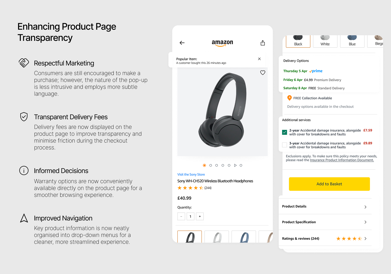
Amazon aggressively markets products using tactics like flash sales, fake scarcity, and urgency to pressure customers into buying.

Placement of CTA Buttons

Crucial CTA buttons are strategically placed above the fold for immediate visibility, which can mislead users into making uninformed checkout decisions.

Interface Interference

Manipulating the UI to prioritise information, hiding terms & conditions in the small print, using colour and emphasising on the “free shipping to divert the users attention from the price.

Preselection

Amazon preselects £4.99 Premium Delivery to make Prime seem like better value, using a default option and strategically placed CTA to steer user choices.

No Guest Checkout

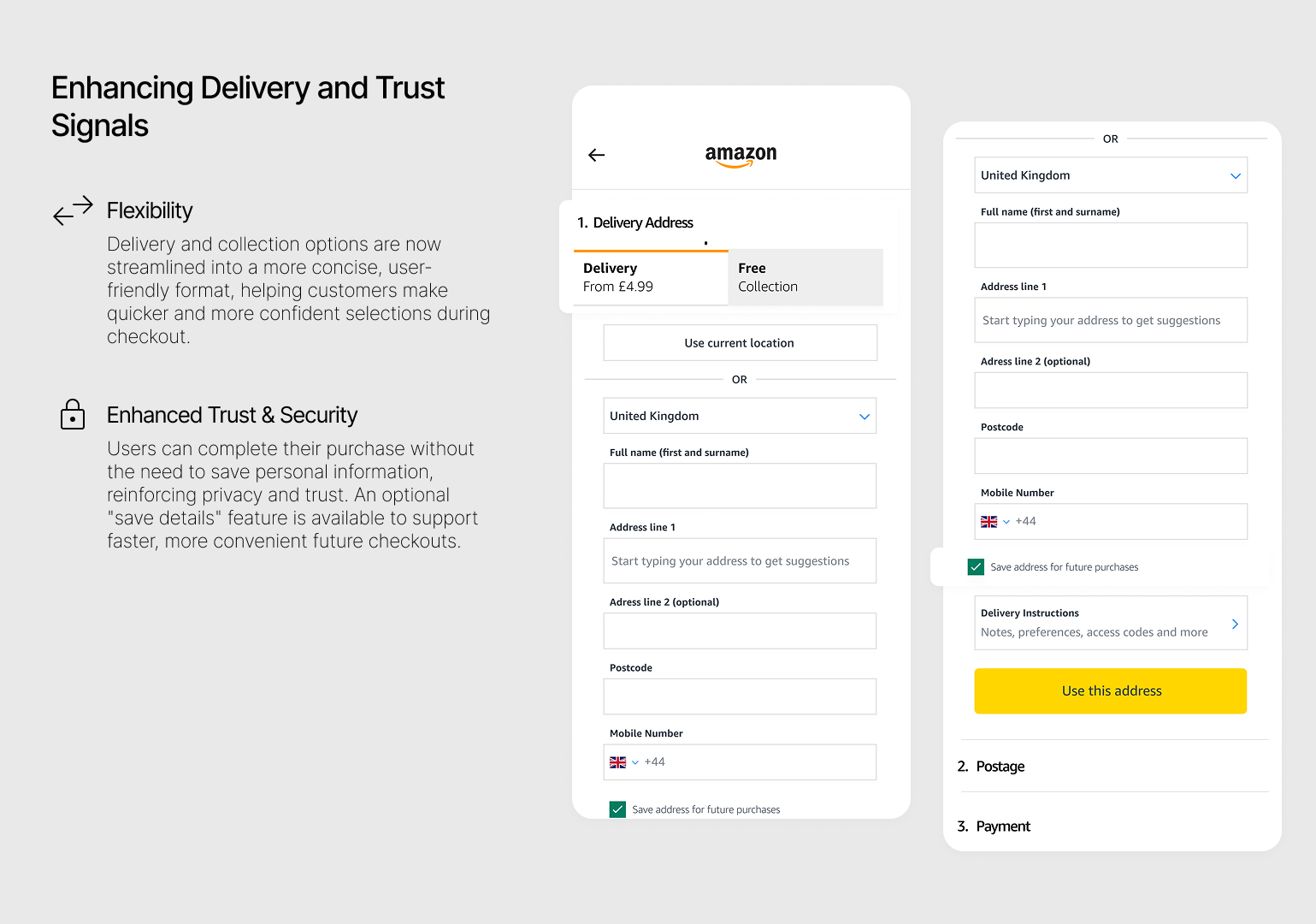
No guest checkout can mean lower conversions, higher cart abandonment, and lost sales from users who want a fast, frictionless purchase.

Privacy and Security

Forcing users to save sensitive info during checkout can raise privacy concerns, making some uneasy about sharing data without clear security assurances.

Warranty

Warranty details appear only once in a pop-up, with key info buried in long, small text—limiting visibility and hindering informed decision-making.

Research

Competitor Analysis

Analysing E-Commerce competitors: I conducted a comprehensive competitor analysis to uncover industry best practices and potential areas of differentiation among e-commerce competitors. I gained valuable insights into the various approaches taken by competitors identifying common trends and patterns, as well as unique features and strategies.

Further analysis of subscription-based services: In addition to e-commerce competitors, I analysed subscription-based services like Netflix, Spotify, and Apple Music. This investigation aimed to understand their effective design and marketing strategies for promoting subscriptions.

    • The clarity of pricing information
    • The transparency of subscription terms
    •Techniques to encourage users to subscribe to subscription services

This exploration provided me a basis of how competitors addressed the users experience alongside deploying marketing techniques to encourage users to signup to subscription-based services. These insights provided valuable inspiration for me to begin creating innovative design solutions to Amazons deceptive approach.

Research

Customer Journey Map

To deepen my understanding of how each segment of the flow relates to the user experience, including emotional responses, I crafted a customer journey map. This map broke down user interactions at each stage, highlighting emotional responses, pain points, and moments of delight. It also unveiled user needs and expectations, critical touch points, and opportunities for improvement. By analysing user behaviour patterns and their implications for design decisions, the journey map provided valuable insights that guided targeted enhancements and a more user-centric design.

Additionally, the user journey map aided in pinpointing specific pain points within different sections of the user flow. This facilitated the rearrangement of elements during the minimisation of the customer journey, ultimately boosting the efficiency of the checkout process.

Design

Final Resolution

Lorem ipsum dolor sit amet, consectetur adipiscing elit. Donec facilisis metus ut erat bibendum, vulputate semper sapien fringilla. In blandit mi velit, at imperdiet nulla venenatis sit amet. Mauris laoreet eros in blandit iaculis. Sed hendrerit sem et augue gravida, ac rhoncus nulla bibendum.

Design

Usability Testing

I conducted usability tests to measure the success of the design changes, and I'm pleased to report that all responses were positive. Users found the new interface intuitive and user-friendly, appreciating the clarity and streamlined process. The enhancements received praise for simplifying navigation and reducing friction, ultimately leading to a more satisfying user experience.

Scarlet
"Much easier than my previous Amazon experiences, usually Amazon is very hard to navigate."
Jack
"Really easy, it was simple and straight forward to use."
Evan
"It was pretty easy, nothing was difficult, it was all streamlined and very simple."

Contact

Email
Linkedin